The100: Logo throwbacks, marketing mistakes and Vikings
Have the last laugh
The use of humour in advertising has nosedived over the last 15 years. As of 2020 just 34% of adverts were funny or lighthearted, down from 53% in 2004.
And the bottom line isn’t laughing either. Recent studies have shown humorous adverts tend to be more effective, and have a significant, positive correlation with:
- Attitudes towards the ad
- Attitudes towards the brand
- Attention
- Positive emotions
- A reduction in negative emotions
- Most importantly, purchase intent
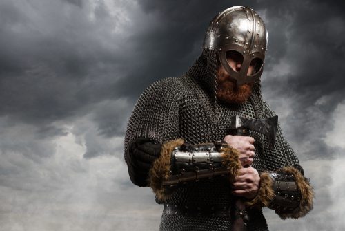
A most wonderful case in point is a recent advert from the Danish Road Safety Council which led to a 4% increase in non-helmet-wearers buying one.
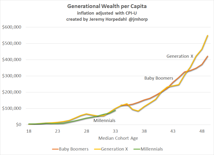
The millennials might just be ok
Are millennial pockets really haemorrhaging more severely than those who came before them? Contrary to popular opinion, perhaps not:
Never underestimate how much a person can eat
These 3 marketing campaigns were, in the modern parlance, an absolute soup sandwich. Why? Because they completely misunderstood their customers and their perceptions.
Illustrated most excellently by A&W and their “Third-Of-A-Pound” burger. It was designed to compete with McDonald’s Quarter-Pounder and even won in taste tests, but it never took off.
“We were aggressively marketing a one-third-pound hamburger for the same price […] but despite our best efforts, including first-rate TV and radio promotional spots, they just weren’t selling […] More than half the participants of the Yankelovich focus groups questioned the price of our burger. “Why,” they asked, “should we pay the same amount for a third-pound of meat as we do for a quarter-pound of meat at McDonald’s? You’re overcharging us”. ”
Internet whac-a-mole

The iron laws of money
Morgan Housel writes brilliantly about one of the most important yet hardest financial skills: getting the goal posts to stop moving.
“If expectations grow faster than income you’ll never be happy with your money.”
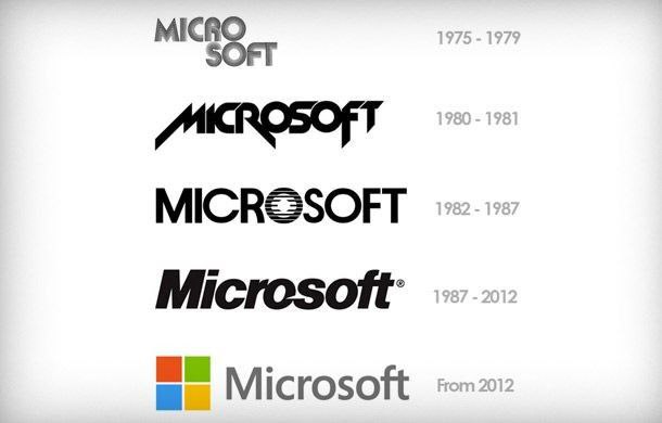
Even Microsoft had a “phase”
This comparison of old vs. new logos is a very pleasing meander through time.
I love Microsoft’s 1980-81 logo and how it looks like a metal band ?
Having a whale of a time
And finally, a rare glimmer of hope. 1,000 fin whales were seen swimming in the same area where they were driven to near extinction. Hello feel-good-friday.
And that, dear readers, is that. Alistair is back for the next issue of The100 on Friday 11th February. It really has been a pleasure.
Over and out,
Fran
Comments
Comments are disabled for this post